I am a
U-Boat Timeline
2016
Interactive Historical Data Visualization
The U-Boat Timeline is an interactive data visualization built with D3.js. The project involved extensive research, data scraping, data cleaning, and exploratory visualization.
Visit the interactive timeline![]()
Research & Data Collection
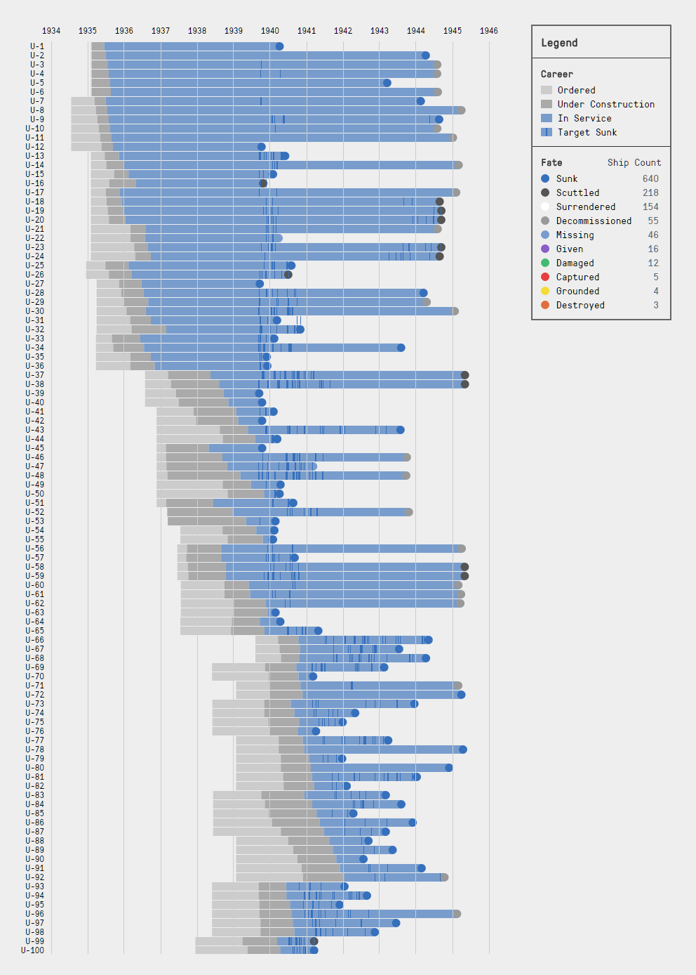
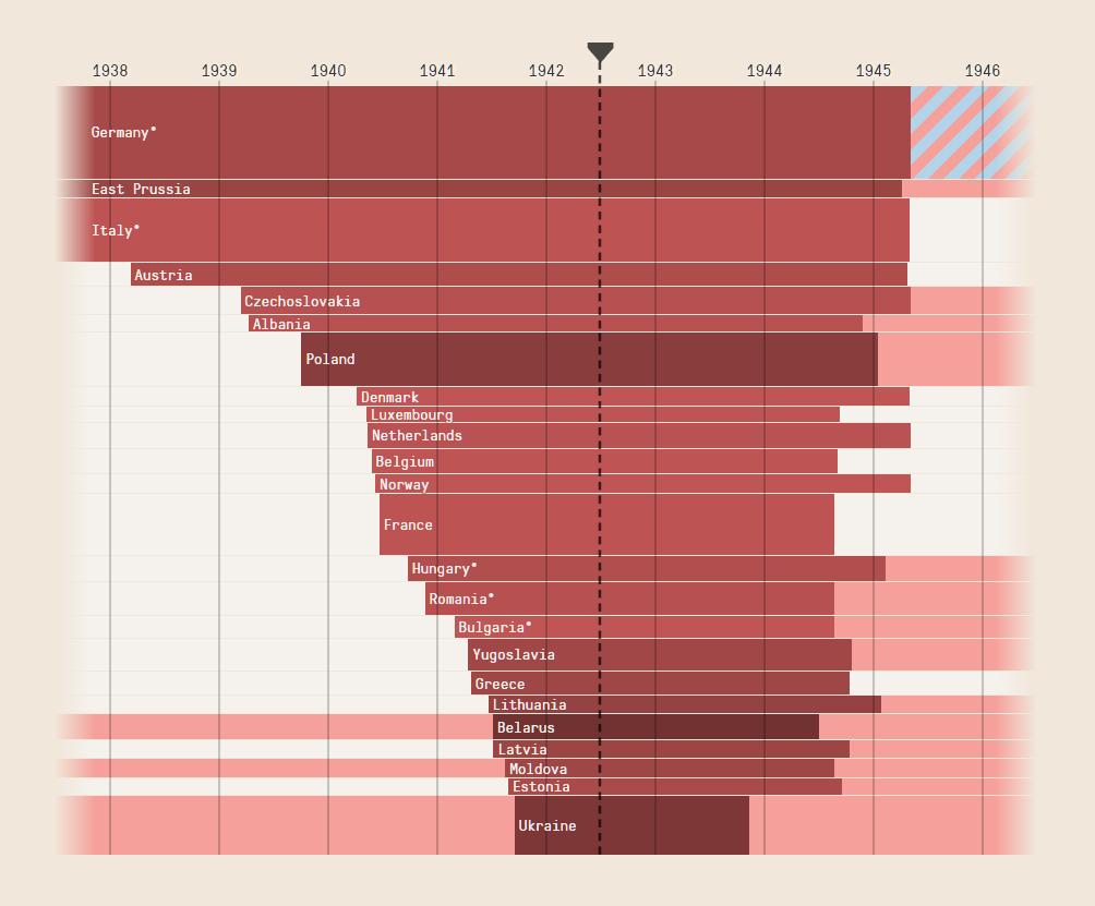
I was particularly interested in visualizing and studying data from U-Boats for their systematic organization (numbered from U-1 to U-4712) and their sheer number (1,153 in total). By contrast, America only commissioned around 300 submarines during WWII, and their naming/organization scheme was not nearly so tidy. U-Boats have remained a defining piece of World War II in public consciousness, in part because of their effectiveness in terrorizing allied merchant fleets, sinking a combined total of over 3,400 ships.
My primary data source was the site Uboat.net, which has painstakingly compiled detailed information on every U-Boat and every ship sunk by a U-Boat. I used the tool Import.io to scrape a huge volume of data from the site: ship names, when ships were ordered/constructed/ended service, casualties from sinkings, shipyards, commanders, and more. Using Excel, I cleaned and extracted usable data (converting long dates to short dates, standardizing inconsistent data).
Exploration
Using Tableau, I explored dozens of possible data visualizations, looking for interesting trends in the data. I examined U-Boat successes over time, the most successful commanders, the navies with the most ships sunk. I found that the British by far took the brunt of the U-Boat threat, losing over 1,500 ships and 40,000 sailors (by comparison, the US, the next worst effected, lost only 500 ships and 10,000 sailors). I discovered that U-Boat's were most effective from the beginning of the war until their peak in 1942, after which their was a sharp decline in number of Allied ships sunk. I've written about those findings and others in a companion Medium piece. Read it here![]()
Development
I chose to build the visualization with D3.js, which is the current standard for building data visualizations on the web. I decided to visualize the U-Boat data in a comprehensive timeline rather than a series of cumulative visualizations such as bar charts and line graphs. The timeline provided a more intriguing challenge; whereas open source code for simple visualizations such as bar charts is widely available, the unique nature of this project required coding the entire visualization from scratch. The timeline communicates the sheer number of U-Boats and some trends across time (e.g. the shorter construction times at the end of the war compared to before the war), as well as information about specific U-Boats.
In the future, I plan to include filtering features to allow users to change the date range, search for a specific U-Boat, and show only the U-Boats of a certain type or which had a certain fate.
Please visit the interactive timeline to see the full visualization and read the companion piece on Medium. The source code and data is available open-source on the project GitHub repository.
Under Foreign Flags
2018
Interactive Data Vis Essay
Under Foreign Flags is an interactive essay charting the extent of the Axis powers in WWII with timelines and maps.
Research
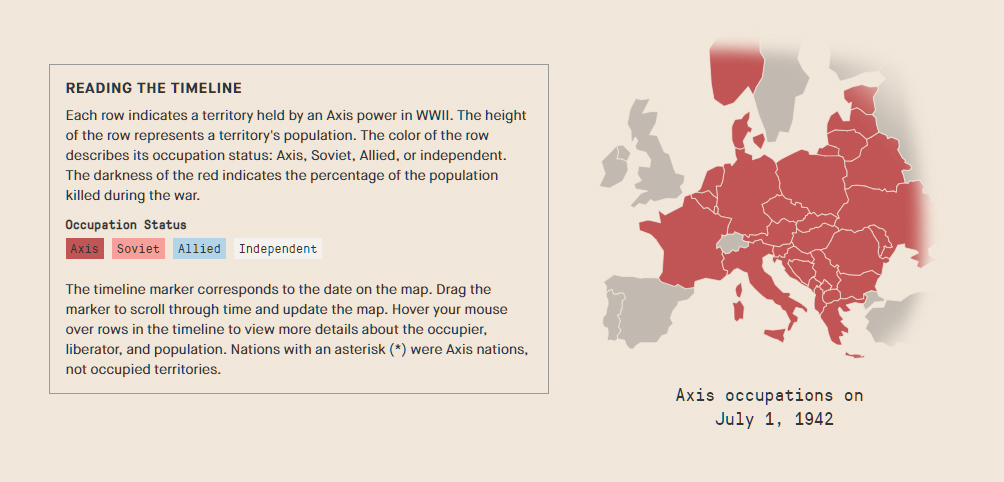
I researched and tabulated the occupation and liberation dates, populations, casualties, and pre/post-war occupiers for each territory that was occupied by an Axis nation. The essay comprises the three major theaters of war: Europe, Africa/Middle East, and Asia, each with an accompanying map and timeline. The essay provides context to the visualization with a concise overview of the campaigns of World War II.
Visualization
I used D3.js to program the map and timeline. An interactive timeline marker updates the map to reflect the extent of Axis occupation at that point in the war. It was my first project to incorporate D3.js maps, and required modifications to the modern map file with correct WWII-era borders and territory names.
Dashboard
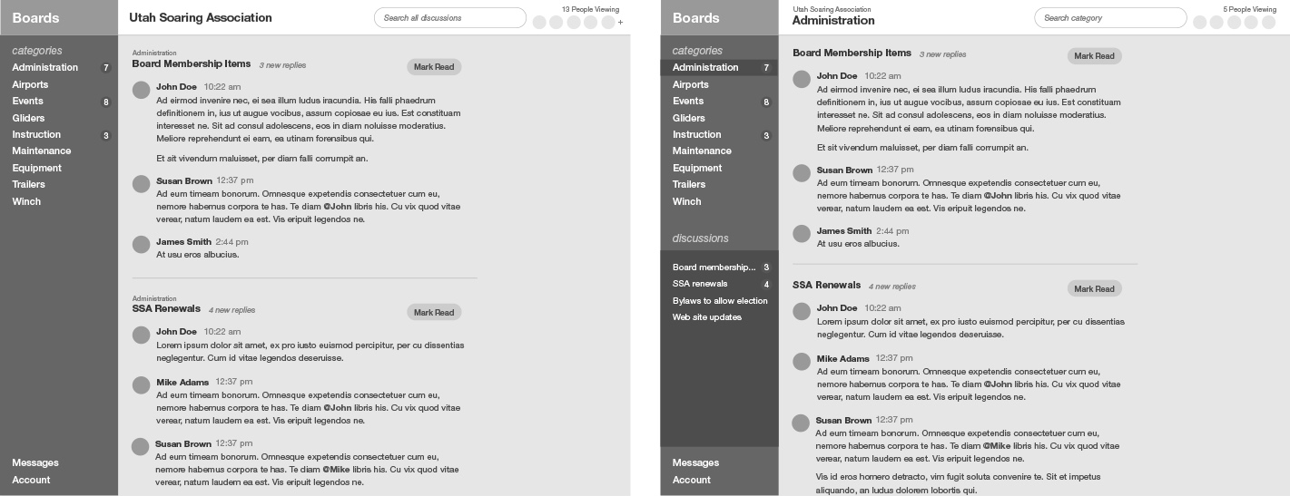
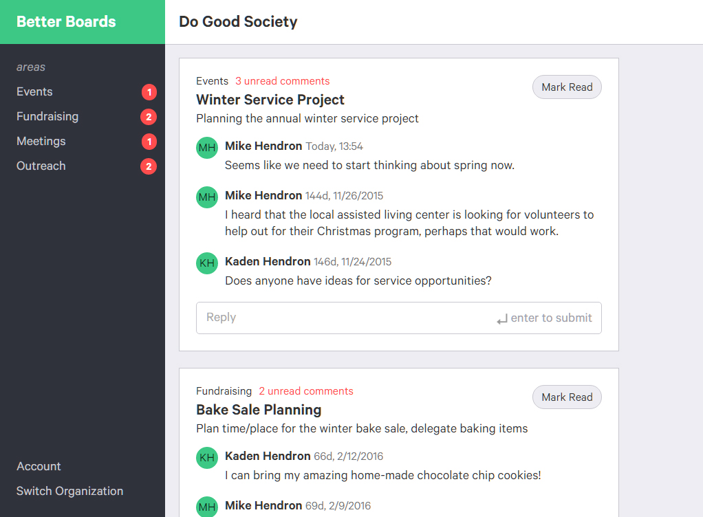
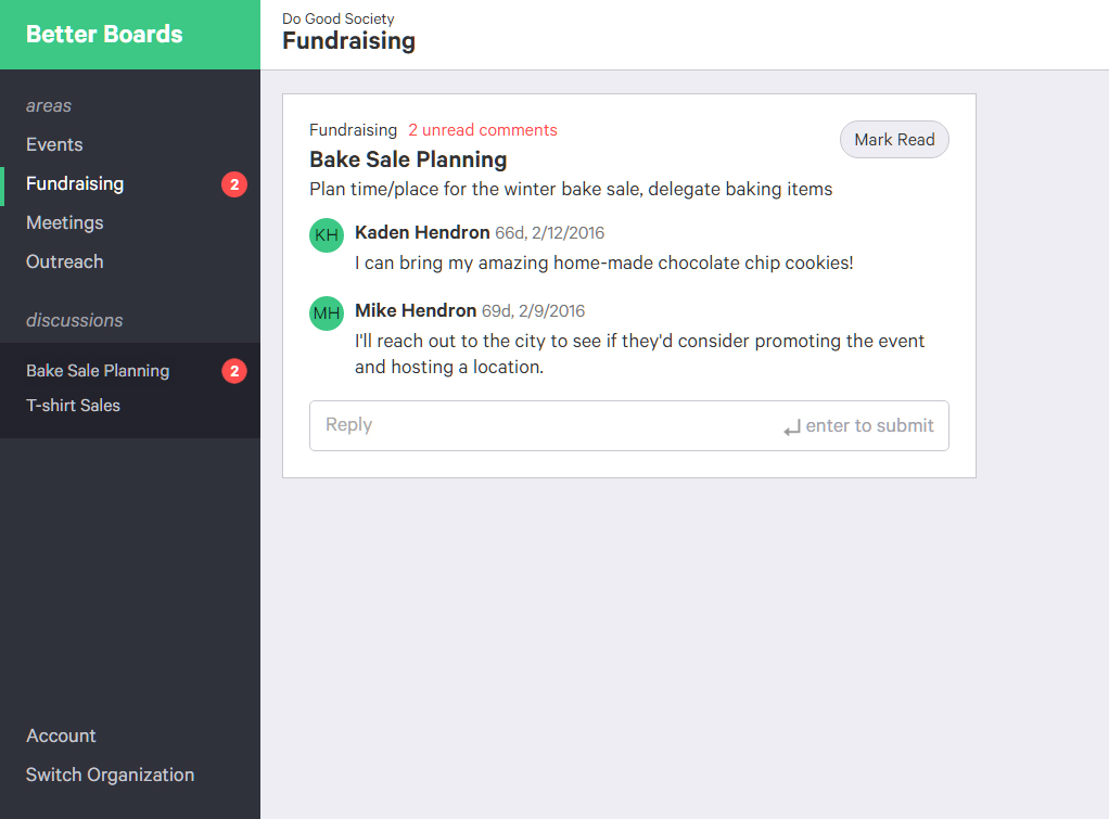
The first thing a user sees upon sign in is the dashboard digest view. The digest view shows any discussions that have unread comments. The user can scroll down the page and click "Mark Read" when they've read the new comments, or click on the discussion name to see the entire discussion history. This allows the user to get completely caught up on all new activity in the organization without navigating to another page.
Areas
Area pages are the same as the dashboard, except the digest view is limited to discussions in that area. A navigational list in the sidebar allows the user to view specific discussions.
Border radius is deliberately applied in varying amounts to different elements. Informational elements, such as cards, have no border radius. Form elements, such as the reply field, has a 5px border radius
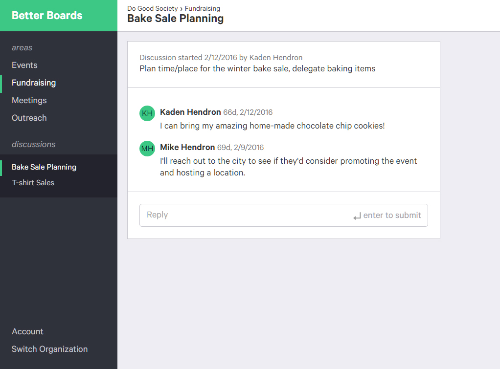
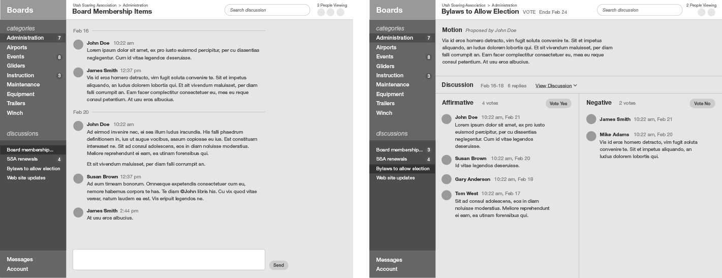
Discussions
Discussion pages show complete discussion history and allow a user to reply to the thread.
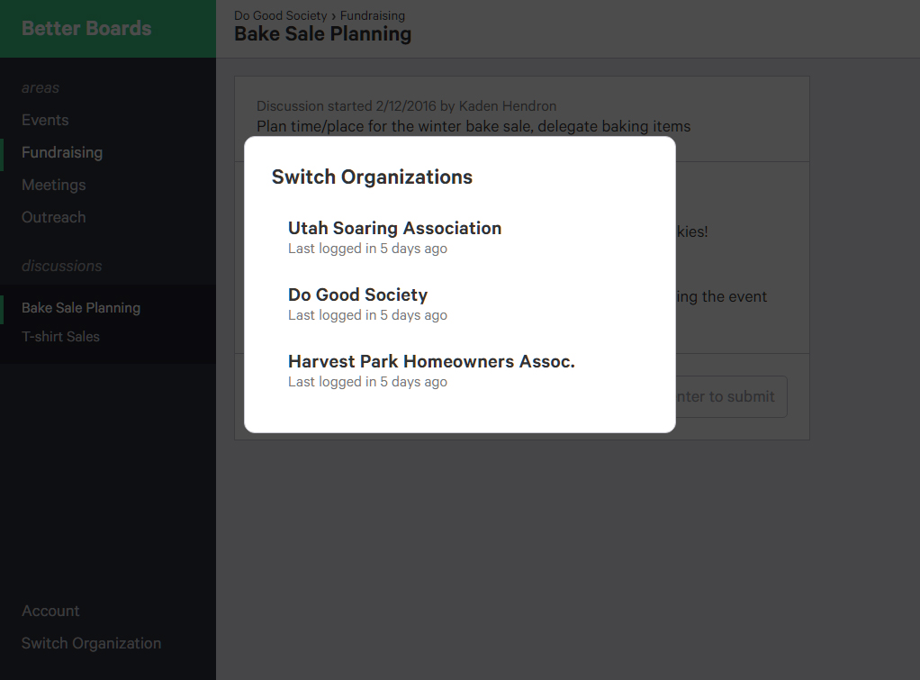
Switching Organizations
Users on multiple boards can quickly switch between organizations they are involved in.
Better Boards
2016
Communication Platform for Leadership Boards
Better Boards is a platform for board members of business, non-profit, and academic organizations to discuss and vote on decisions. I developed the front-end site with HTML, SASS, and JavaScript, and collaborated with a back-end developer through GitHub to create a fully-functioning platform. I also developed the user experience through user research, wireframing, and user testing processes.
User Research
My primary source for user research was conversations with actual board members. I spoke with people involved in non-profit organizations such as clubs, HOAs, and PTAs, as well as academics and businesspeople.
In interviews, I asked questions about their current processes for discussion, decision making, task delegation, and meeting and event planning. I asked for information such as a person's role in the organization, the type of organization, and the size of the board so that I could better quanity my results.
Among those I interviewed, I found that the primary communication and decision making processes were e-mail chains and in-person meetings. It was very apparent from those e-mail chains how inefficient that system was: discussions often strayed to impertinent topics or simply died from inactivity before a decision could be reached.
Another source of research was Robert's Rules of Order, a book originally published in 1876 and still the most widely accepted model for decision-making organizations. It provides specific, codified rules for how meetings should be conducted, how voting should be held, and how to preserve civility in discussions. A primary goal in designing Better Boards was to create a platform open enough that a variety of organizations could use it, but structured enough that it enforced best practices as presented in Robert's Rules.
Development
I began prototyping by sketching a variety of plausible user flows and sitemaps, then recreating the most effective layouts in Sketch. I designed digital wireframes with only minimal styling, outlining content and hierarchy but not color or typography. I iterated rapidly though different layouts based on feedback from potential users and other designers.
Once I felt assured in the direction of my wireframes, I began coding. Beyond this point my design tool was the code editor and the browser. Using SASS made styling elements powerful and consistent across the entire project. I worked simultaneously with the back-end developer to connect the database to the front-end markup and display live content on the platform. Using GitHub allowed us to work on different parts of the site independently and merge our code when complete.
Throughout the design and development process there were key UX decisions to be made. I made an effort to test options with different users and make the most effective decision. I've noted several of my decisions and the thinking behind them next to the product screenshots on the left.


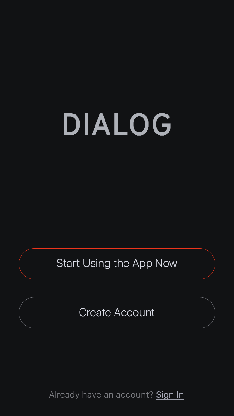
Start
Upon downloading the app, the journalist can start using the app, create an account, or sign in.
Account creation allows the user to sync completed interviews with the Dialog cloud service and receive additional subscription features.
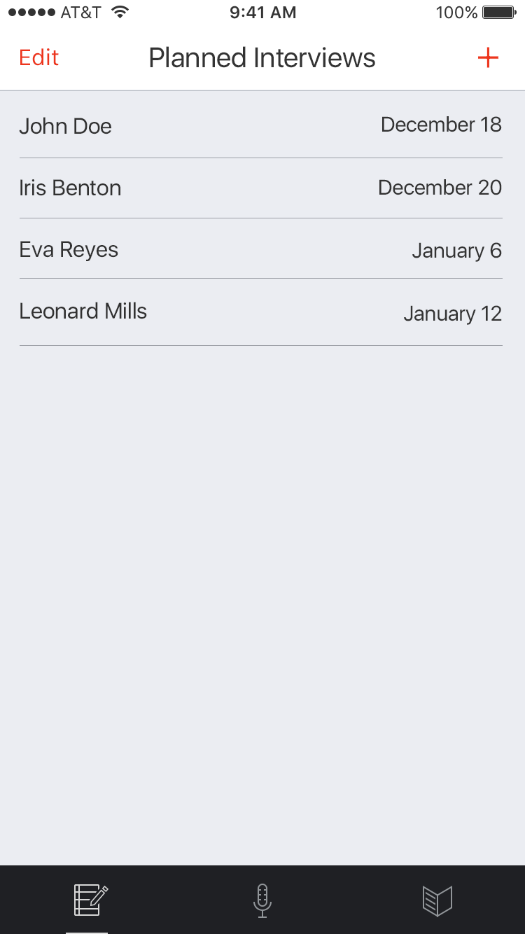
Plan
The journalist plans an interview—a list of questions, the planned time and location, and the interviewee's contact information.
The journalist also has the option to record an impromptu, unplanned interview.
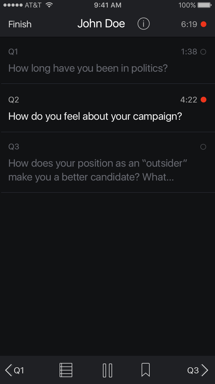
Record
The journalist begins recording and navigates through questions as the interview progresses. Advancing to the next question segments the recording, simplifying the transcription.
At moments of interest, the journalist leaves bookmarks or writes notes.
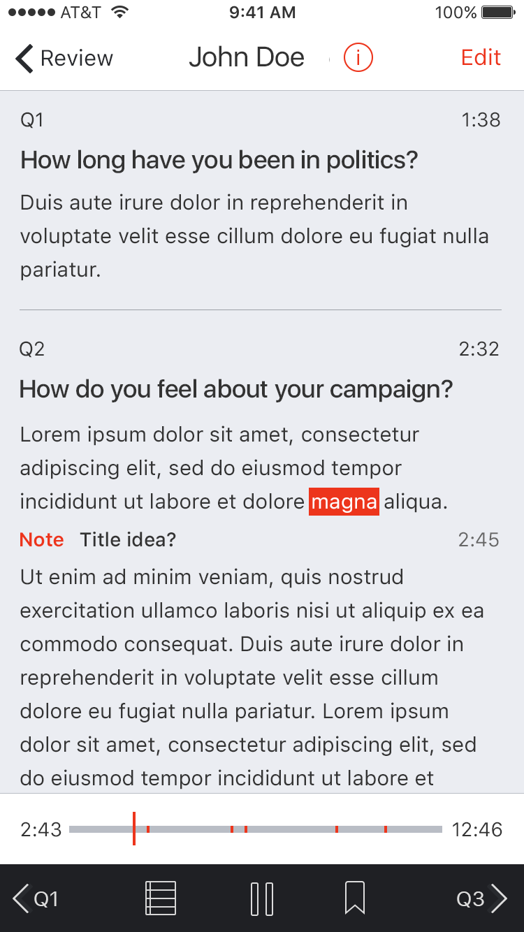
Review
When the interview is complete, the app transcribes the audio to text. The journalist views the text transcription synchronized with the audio playback and reviews any notes or bookmarks.
Dialog
2015
Mobile App for Journalists
Dialog is an app for journalists to plan, record, and review interviews all on their mobile device. I led a 3-person team through extensive user research, wireframing, and user testing processes.
User Research
Through conversations with journalism faculty, students, and professionals, we learned some of their key pain points. The interview process is outdated and inefficient. Journalists often use separate programs and devices to plan, record, and transcribe interviews. Transcribing audio to text is especially time-consuming and difficult; 20 minute interviews can take up to 2 hours to transcribe. Some things journalists said:
"I take notes in a Google Doc and record with the Voice Memo app, then type it up on my Mac."
"I would like to be able to bookmark times in interviews at important points.
"I listen to the recording with headphones on my phone and type it out on my MacBook. It takes a over two hours because I have to go back and listen to parts multiple times to make sure I quoted them correctly."
Wireframing
We documented each part of the app with dozens of wireframes and several iterations; first on paper, then in Sketch. We used Invision to test interaction and user flows.
High Fidelity
In the high fidelity stage we revised our interface and user experience based on user testing and feedback. We also developed the visual style with color, typography, and custom icons. Care was taken to maintain the aesthetic and interactivity of an iOS app.
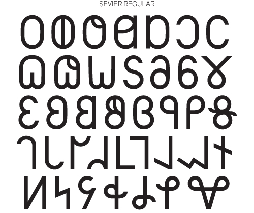
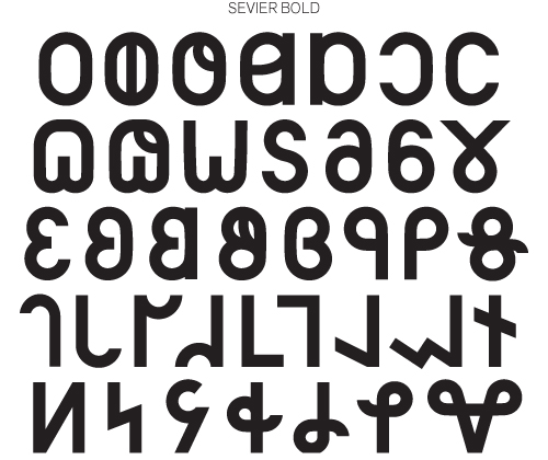
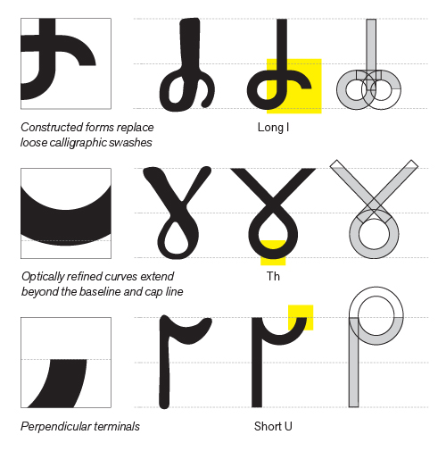
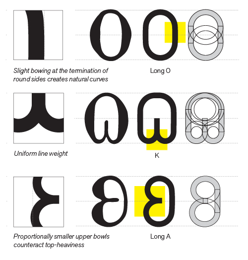
Sevier Typeface
2015
Sans-serif Deseret Alphabet
Sevier is a revival typeface of the Deseret Alphabet featuring 38 characters in two weights, Regular and Bold.
The Deseret Alphabet was created in the mid-19th century by leaders of the Mormon religious movement in Utah. The alphabet’s 38 characters each represent a single phonetic sound. The original letterform designs are rather inconsistent, mixing round and angular shapes and lacking uniform line weights. Though Sevier’s letterforms remain true to the original Deseret Alphabet designs, their construction has more in common with the constructed, geometric forms of early 20th-century type, such as DIN 1451 Mittelschrift.
The typeface is named for Sevier Lake (a large dry lakebed in western Utah) and its severe, unadorned form (pun intended).
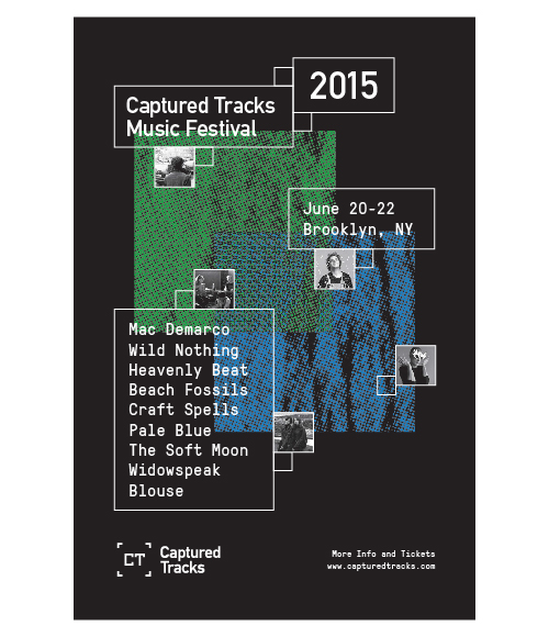
Captured Tracks
2015
Record Label Rebranding
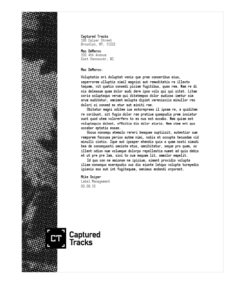
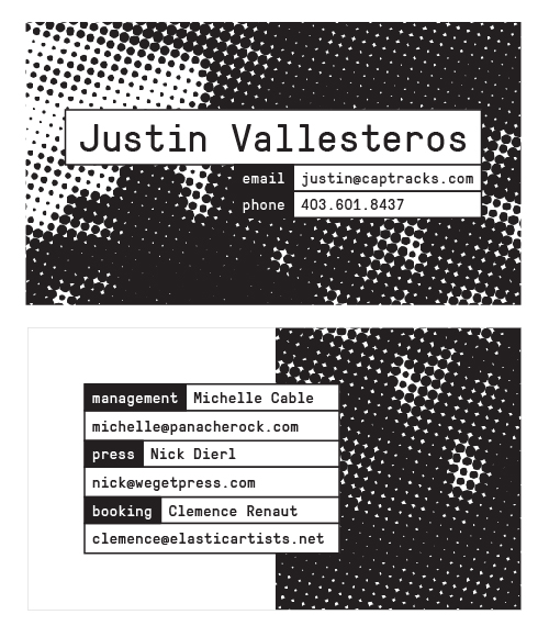
This project is a self-initiated rebranding Captured Tracks, an independent record label in Brooklyn, NY. I created a flexible logo system to allow images or motion graphics to be incorporated into the [CT] logomark. I also designed branded event posters and a stationery system (letterhead, business cards, and envelopes).
Motion Reel
2015–2016
2D and 3D Motion Design
Motion reel compiling a variety of projects completed in 2015 and 2016. Created with After Effects and Cinema 4D.
Full length version of the projects in the reel can be found here:
Hi, I'm Kaden. I graduated from BYU with a BFA in graphic design, emphasizing in UI/UX and data visualization. I code in HTML, SASS, JavaScript, PHP, and D3.js. I believe in building intuitive, user-centered products.
Get in touch: kadenhendron@gmail.com
RevRoad 2017
UI/UX design. Designed desktop and mobile products for several startups in RevRoad’s accelerator program. Worked closely with decision makers and developers to create a minimum-viable-product then iterate to refined versions.
Podium 2014-2016
UI/UX design and branding. The sole designer at a rapidly growing technology startup. Lead UI/UX design of desktop and mobile SaaS products used by over 30,000 companies including Ford and Hertz. Developed user personas and user stories and participated in customer research and testing. Communicated and refined designs with developers and stakeholders with Invision.
Izeni2014
UI/UX design. Designer at software development agency. Worked closely with clients to develop user experiences from business ideas. Cooperated with engineering team to put designs into production.
ChatAds2013-2015
UI/UX and marketing design. Designed marketing site and product user interfaces and communicated designs to developers. Designed advertisements for local and national brands.
References available on request.